| Stay Connected |
 GUNetwork GUNetwork
|
| April 2024 | | Mon | Tue | Wed | Thu | Fri | Sat | Sun |
|---|
| 1 | 2 | 3 | 4 | 5 | 6 | 7 | | 8 | 9 | 10 | 11 | 12 | 13 | 14 | | 15 | 16 | 17 | 18 | 19 | 20 | 21 | | 22 | 23 | 24 | 25 | 26 | 27 | 28 | | 29 | 30 | | | | | |  Calendar Calendar |
|
| April 2024 | | Mon | Tue | Wed | Thu | Fri | Sat | Sun |
|---|
| 1 | 2 | 3 | 4 | 5 | 6 | 7 | | 8 | 9 | 10 | 11 | 12 | 13 | 14 | | 15 | 16 | 17 | 18 | 19 | 20 | 21 | | 22 | 23 | 24 | 25 | 26 | 27 | 28 | | 29 | 30 | | | | | | | Calendar |
|
| Forum Graphix Competition | | Forum Graphix Competition |  |
| |
| Author | Message |
|---|
anstand

Posts : 59
Join date : 2014-02-25
 | | Subject: Re: Forum Graphix Competition Wed 26 Feb 2014 - 15:35 | |
| |
| | | | Jimmakos

Posts : 147
Join date : 2014-02-28
Age : 33
Location : Pyrgos, Greece
| | Subject: Re: Forum Graphix Competition Sat 1 Mar 2014 - 23:55 | |
| _________________  |
| | | | endgameaddiction

Posts : 91
Join date : 2014-03-01
Location : ᵴᶅὴ ﻊᶅﮌᶙ
| | Subject: Re: Forum Graphix Competition Sun 2 Mar 2014 - 20:28 | |
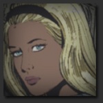
| Anything in specific for the banner? Like does it have to be related to Fallout or games in general? Or as simple as VGU Network and some crazy effects behind it will do? I guess keep it between a little Fallout would help like the others with the bolt in the O. |
| | | | DVAted

Posts : 5995
Join date : 2014-02-23
Age : 35
Location : in the forests of the night
Character sheet
Name: DeViAted
Faction: GUNners
Level: 55
| | Subject: Re: Forum Graphix Competition Mon 3 Mar 2014 - 1:51 | |
|
@Jimmakos - you still made them too big though xD
@endgame
putting a vault boy in seems a bit too limiting of the identity and purpose of the site.
sure, we have fallout mods, but we'd like everything else as well.
putting a bunch of characters from a bunch of videogames in would seem too crowded, though
best bet is to go with a catching background and a nice font
also, if you can include, in smaller text, the whole words:
"Video Games Underground Network"
that would let a lot of people know what VGU stands for
in case there are still misunderstandings.
'preciate it and good luck
|
| | | | Jimmakos
Posts : 147
Join date : 2014-02-28
Age : 33
Location : Pyrgos, Greece
| | Subject: Re: Forum Graphix Competition Mon 3 Mar 2014 - 4:45 | |
| I had in mind making one banner myself but i knew that this would be time consuming and i dont have that much atm.A good banner would indeed had to have a "Video Games Underground Network" or "VGU network" as center and might the volt boy right and a skyrim armor helmet to the left with a bunch of art round round
@DVAted
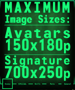
How much excactly is the size of the forums icons,i can resize them if you want and you can give them a test _________________ |
| | | | endgameaddiction
Posts : 91
Join date : 2014-03-01
Location : ᵴᶅὴ ﻊᶅﮌᶙ
| | Subject: Re: Forum Graphix Competition Mon 3 Mar 2014 - 5:02 | |
| Alright, my gimp skills are.. gimp but I'll see what I can do  |
| | | | DVAted
Posts : 5995
Join date : 2014-02-23
Age : 35
Location : in the forests of the night
Character sheet
Name: DeViAted
Faction: GUNners
Level: 55
| | Subject: Re: Forum Graphix Competition Mon 3 Mar 2014 - 5:37 | |
| |
| | | | Jimmakos
Posts : 147
Join date : 2014-02-28
Age : 33
Location : Pyrgos, Greece
| | Subject: Re: Forum Graphix Competition Mon 3 Mar 2014 - 8:38 | |
| Take a look on the icons Current:  Modified (bluish):  Current:  Modified (more red):  optional: Current:  Modified:  As for the banner i might try but im not promising anyrthing since im shit at making banners lol _________________ |
| | | | DVAted
Posts : 5995
Join date : 2014-02-23
Age : 35
Location : in the forests of the night
Character sheet
Name: DeViAted
Faction: GUNners
Level: 55
| | Subject: Re: Forum Graphix Competition Thu 3 Apr 2014 - 8:12 | |
| |
| | | | Old Coot

Posts : 136
Join date : 2014-03-20
Age : 77
Location : In the mountains of Northern Ca.
| | Subject: Re: Forum Graphix Competition Thu 3 Apr 2014 - 9:33 | |
| |
| | | | OlgaK
Posts : 51
Join date : 2014-04-01
| | Subject: Re: Forum Graphix Competition Thu 3 Apr 2014 - 9:43 | |
| Okay, I gave a look at the thread, I really like the SixShooter's folders, very well done, noticed them first when I looked at the site. Also the Samatron's icons "who's online" have a nice concept and design, the colors perhaps were a little unfitting, but nice work.
DVA I see you have definitely some preferences and that's what exactly I was asking in the other thread. I see you favor a futuristic/clean style, the Mass Effect fonts are an example.
Okay, it seems the major need are the little elements. As soon as I can work on it, I'll submit some.
:-) _________________  |
| | | | DVAted
Posts : 5995
Join date : 2014-02-23
Age : 35
Location : in the forests of the night
Character sheet
Name: DeViAted
Faction: GUNners
Level: 55
| | | | | Old Coot
Posts : 136
Join date : 2014-03-20
Age : 77
Location : In the mountains of Northern Ca.
| | Subject: Re: Forum Graphix Competition Thu 3 Apr 2014 - 10:55 | |
| No. Because I was just playing around. Heh! |
| | | | OlgaK
Posts : 51
Join date : 2014-04-01
| | Subject: Re: Forum Graphix Competition Fri 4 Apr 2014 - 0:29 | |
| @DVA thanks, the community is far more nicer than I would have hoped for, very glad to be part of it. :-) About the matter at hand, I did some experiments. The site could be refreshed with very little changes, I submit you a possible example, it may look a bit basic but it's a scheme with space for improvement. You see the changes just involves the background that goes repeating on the th secondarytitle and the td cat, the new buttons under the banners and the integrate text in the banner about the site, I've used that banner as reference since it's the one of mine you like, but you could use any and just leave the text in Verdana using 4b4b4b or 4a4a4a or something close to that, it would be fitting imo. I also suggest, in case you are willing to do some changes, to lower the white overall and replace every FFFFFF with at least a b5b5b5 for the text, it still appears to be white, but with less flashy contrast, I think it's much better for the look and the eyes. Another thing, you really did a lazy job assigning the white to all the text, you could achieve a good looking result just with a solid background if you manage to assign the right colors to the text. I'm not a fan myself of mixing too much, but just one different color among a primary one (the color primarily used I mean) shouldn't be bad. So you could keep the "white" as the main one, of course, and just assign to a title a different one, just to reach a nicer visual effect. You see I did give a try assigning the single color to the body background, the site would look more clean, maybe too plain (?), it's an option anyway. I also made a little lateral background, just indicative, which is obviously not to be repeated. Now, after seeing a little the whole thing and some way to improve without drastic changes, I was going to focus on the little elements but it's difficult to do so without a main theme in mind because the elements should be created accordingly. The main theme would be defined by the header but since it's not going to be stable, it's quite hard to decide about one style. You better take a look at the notes in the screen that are quite explicative of everything and see if you have a preference on the little elements, even if I didn't had the time to try much combinations there is a glowing one and some other more solid. The buttons under the banner are obviously based on that banner, but that's very easy to change, not a problem, it's just difficult to decide. There are so many possibilities I'm quite stuck trying to figure out what style would be suitable for any kind of header, or at least what wouldn't be too much unsuitable. In case you still don't come out with any defined preference about shapes, colors, glowing, glass effect or anything, then okay, I'll try to create something keeping it as neutral as I can. It may be not about what you favor, but neither about my personal approach, must be something that suits the site! :-) Hope you like some of the suggestions and things in the scheme. I think it would be worth to do some changes, it's not like you have to code the site entirely. (The first "you" here is referred to all the users of course, the last "you", well… okay, that's you DVAted). :-) Gotta love these spoilers, they gave the pics awful quality even if I didn't resize. Well, I'm not sure how much you can see in there, but that's it. I suppose I can't do nothing about. Layout plain background - Spoiler:
Layout old background - Spoiler:
Layout/example/changes - Spoiler:
_________________ |
| | | | OlgaK
Posts : 51
Join date : 2014-04-01
| | Subject: Re: Forum Graphix Competition Fri 4 Apr 2014 - 0:42 | |
| My goodness, the pics quality got really horrific into the spoilers.  I think I'm not going to post any screenshot of my games in these 7 days I can't link externally. :-) _________________ |
| | | | DVAted
Posts : 5995
Join date : 2014-02-23
Age : 35
Location : in the forests of the night
Character sheet
Name: DeViAted
Faction: GUNners
Level: 55
| | Subject: Re: Forum Graphix Competition Fri 4 Apr 2014 - 0:54 | |
| |
| | | | OlgaK
Posts : 51
Join date : 2014-04-01
| | Subject: Re: Forum Graphix Competition Fri 4 Apr 2014 - 1:16 | |
| Thank you so much DVAted, but... that means from now on I have to work very hard for the site??  I'm so glad to be part of this place, thanks for the trust you gave me, I'll do my best to be helpful. About the layout you see you are the one, in case of changing some title color, that must do the change. And obviously put the two backgrounds in the code for for the th td cells. I'm not really fresh about html, if I ever been, I could try looking around though, to see for a solution for your rotation. If I happen to find something I'll let you know. So, okay, I'll work on what I submitted now to improve some and then we'll see together. Glad you liked it and glad you don't see the pics with that bad low quality, I really can't see them right. :-) _________________ |
| | | | OlgaK
Posts : 51
Join date : 2014-04-01
| | Subject: Re: Forum Graphix Competition Sat 5 Apr 2014 - 1:07 | |
| Okay, after trying pretty much everything, I've reached this conclusion: No glow, gloss, glass and heavy things, I say we must go with shadows and matt. Solid and neat. I'll write down freely my view, I will speak in all sincerity about what would be my choice, the project I worked on, and the whys. The site must look clean and nice, we want when the people come here to feel like in a relaxed but interesting place, sweet to the eyes but with some kind of identity. We can't mix a lot of pretty glowing icons with some glossy ones and then some other style in the way just because that icon alone looks incredibly fine. I know very well what is to do so some effort in creating a good looking element and then discard it, the point is we can't look at the single elements here if we want to do a decent job, we must concentrate on the layout as a whole, make a solid project and integrate simple and functional elements, it's a forum after all, the functionality is the most important. Those arrows with multiple colors each, indicating closed/open/new/popular/non popular, it's very confusing and of any help to anyone, you really must read the legend to understand what the hell they are about since they look pretty much all the same. The user must look at the icons and understand what's that about. I don't say at first glance, one must get accustomed, but really after a couple of time watching them should understand the meaning, otherwise there is something very wrong in the choice has been made to use them. The gradients are another thing I would avoid to use excessively, I used some and calibrated them the best I could for the eyes to almost perceive a solid color, so the most are very minimal, others are more evident but it's nothing crazy. In the end, my main focus has been to do something clear and convenient, I believe it's what is needed. Also tried several combinations of colors for the text in the site code and wrote them down in the notes. Hope you like the scheme and the elements, even if very simple, I just want you to take into some consideration to look at it as a whole because that's what is for, and the convenience for navigate easily. You see my view of the very minimal icons for the threads, arrows and lines, the simplest and easiest thing. I could certainly make a change on the arrows if something more sophisticated is required, I have even some ready since I tried a lot, but looking at the simple ones all in line in a page would be nothing heavy and everything would stay ordered, even if at first sight, watching them singularly, it seems too basic. I wrote a lot but I must spend two words on the general icons, I left them there to see there a lot available to use for different things, the message one that is blue highlighted was for testing, there is the pinned post one, some that could be used for polls or other things. The global announcement would be the conventional world icon with the blue gradient. I tried a "users on line" with the conventional worldwideweb icon and in that case I used a light glowing effect. It's kind of a separate element being down in the page and all. Okay, I think that's all, I tried to be as clear as possible in what I'm proposing. Best thing of all would be to pack up all the icons and backgrounds and try them directly, make the change to the colors in the code and see if it's all satisfactory, there is nothing like to test directly. Then, at that point, make tweaks and improvements where needed/wanted. If you survived my post, whoever you are, here a smile for you :-) I see even in this case (smaller pic) the damn thing hijacked the quality of the pic. Who says the contrary is kind with me, or mean. XD Enjoy the pixallation. - Spoiler:
_________________ |
| | | | DVAted
Posts : 5995
Join date : 2014-02-23
Age : 35
Location : in the forests of the night
Character sheet
Name: DeViAted
Faction: GUNners
Level: 55
| | Subject: Re: Forum Graphix Competition Sat 5 Apr 2014 - 2:36 | |
| pack'em up, let's give them a try |
| | | | OlgaK
Posts : 51
Join date : 2014-04-01
| | Subject: Re: Forum Graphix Competition Sat 5 Apr 2014 - 2:43 | |
| Will do, okay.
Must go out now, when I'll come back I'll submit. _________________ |
| | | | Sponsored content
| | Subject: Re: Forum Graphix Competition | |
| |
| | | | | | Forum Graphix Competition | |
|
Similar topics | |
|
| | Permissions in this forum: | You cannot reply to topics in this forum
| |
| |
| |


 topic
topic new posts in topic
 hot topic
 new posts in hot topic
 locked topic
 new posts in locked topic
 sticky topic
 new posts in sticky topic
 Just messing around. I'm not a graphics dude.


